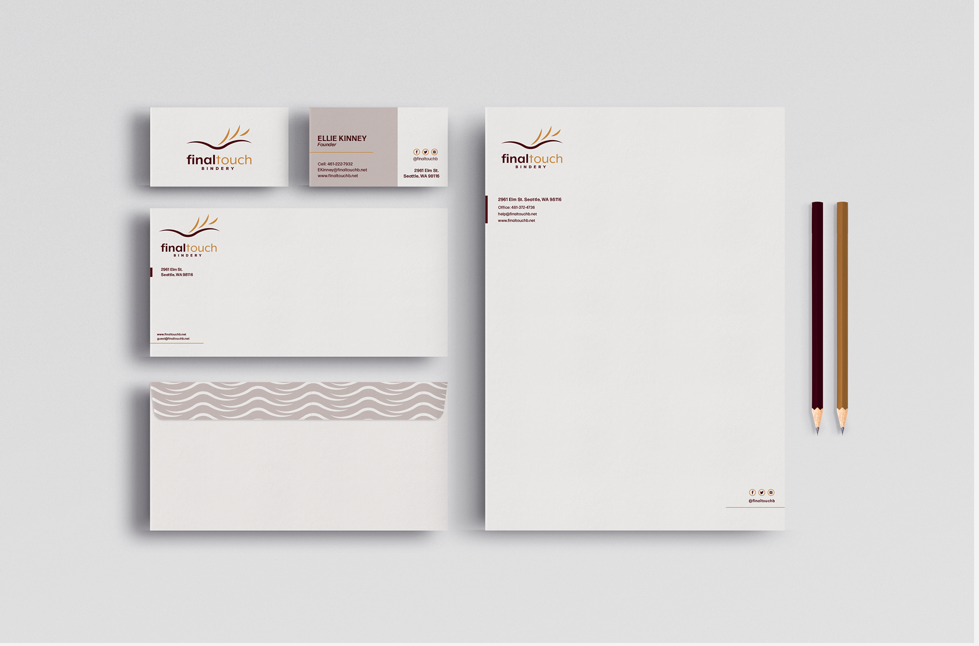
Located in Seattle, WA, Final Touch Bindery specializes in a wide variety of binding needs, such as layout, design, and cover content. These logos were further pushed into stationery, complete with a business card, letterhead, and envelope. We were challenged to keep it simple yet visually intriguing. Detailed study of the primary and secondary icons.
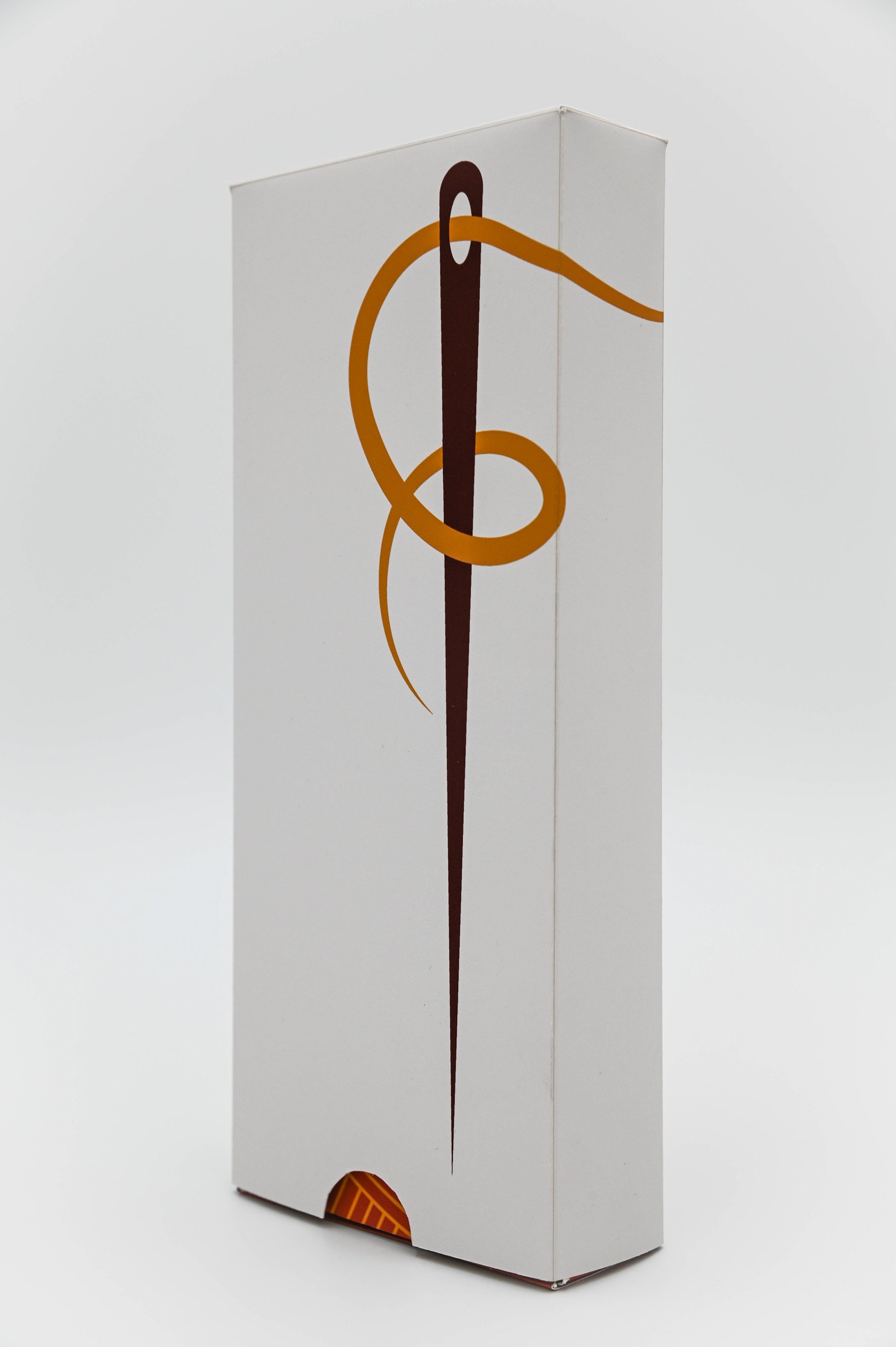
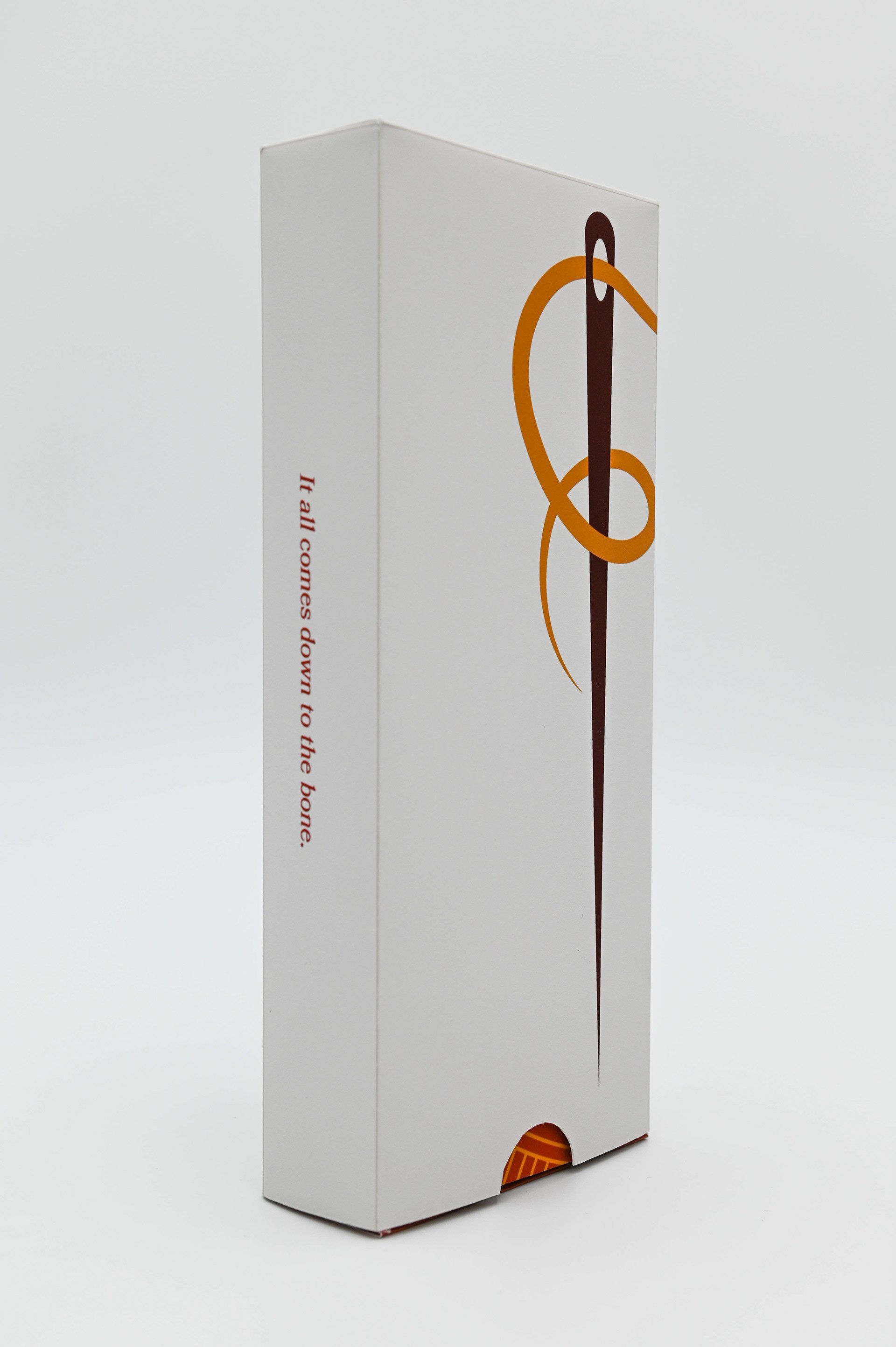
A lettermark created for a bookbinding company called "Final Touch Bindery". Due to the intricacy and intimacy when binding books, I decided to use a needle and thread to form the "F".
I chose gold for the thread to symbolize the value that bookbinding holds.
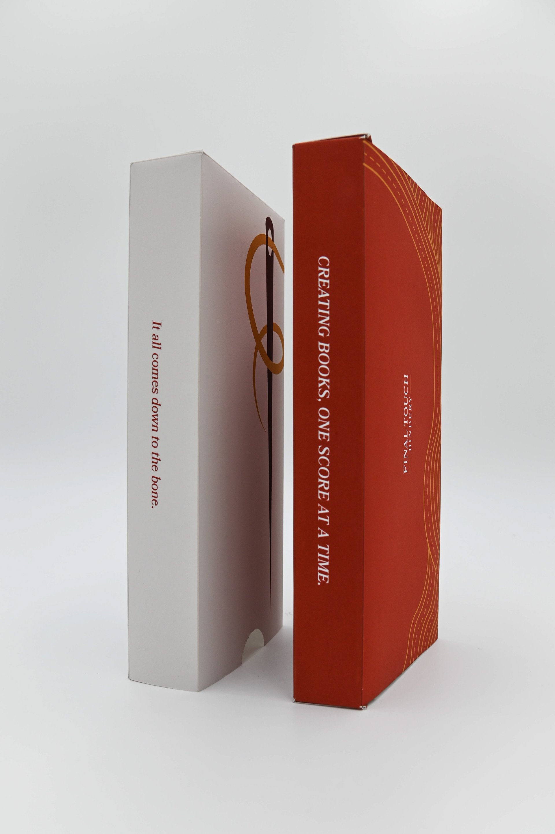
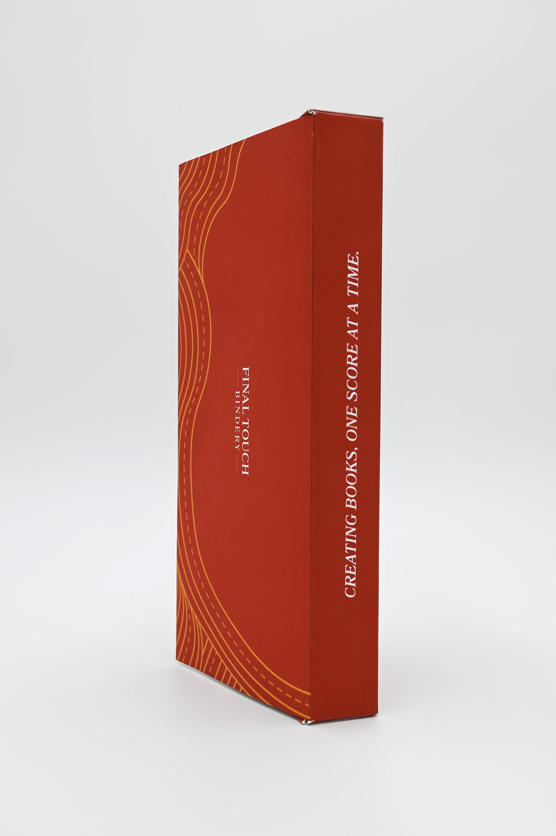
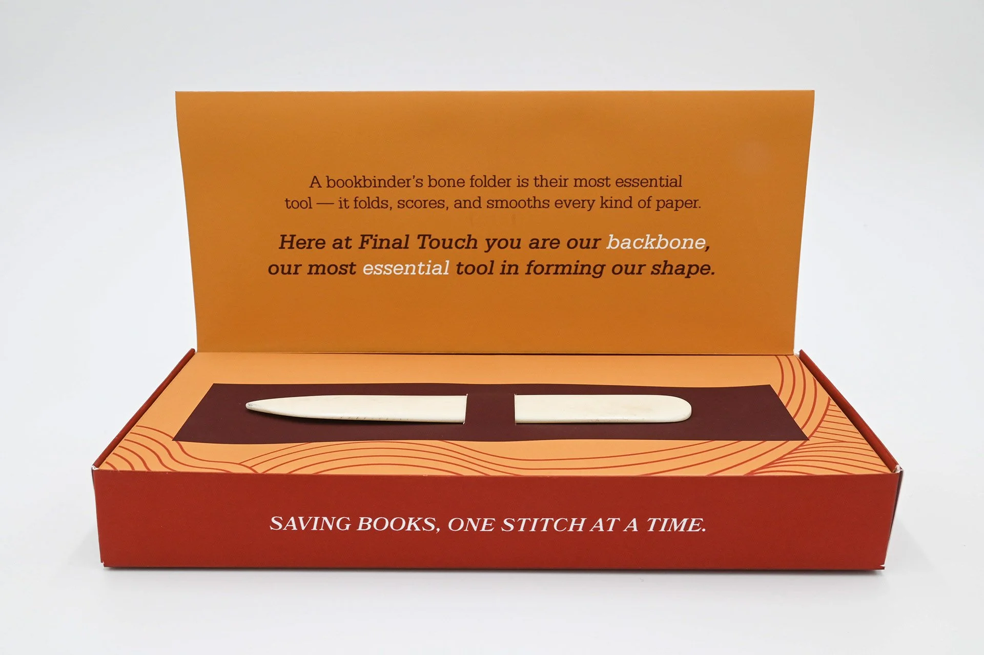
A client-self promotion package design for Final Touch Bindery. This box is mailed out to clients and is used to advertise Final Touch's company and services. A bone folder is presented in the box, because of its versatility, it is known as a bookbinder's most useful and important tool. Connecting to that, on the inside it is stated that the client is Final Touch's most important asset. Allowing the company to move forth and succeed.
Outside of the box has an enlarged lettermark logo that wraps around the box and a saying on the spine. These two elements are used to keep the inside a mystery, but not completely a surprise.